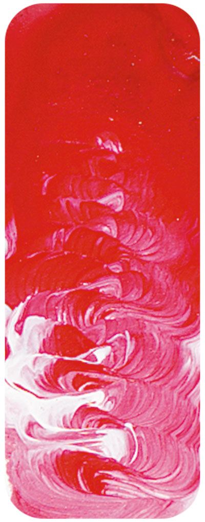
Napthol Crimson Matisse Fluid 135ml
Description
"NAPHTHOL pigments have a long history. The first one was developed in the 1880???s and enjoyed early success under the name para red but it was superseded in the 20th century by superior pigments such as PR170 that were still naphthols but with vastly improved permanence. They get their generic name from the fact that they are phenols that are ultimately derived from naphthalene, although it is also correct to describe them as azo pigments. Prior to the introduction of the quinacridones the naphthols were the most lightfast reds in this colour range hence their use as automotive coatings for many decades. They retain their popularity in the printing inks industry where it is used in high quality printing situations. For inks it is considered to have excellent permanence but in the automotive industry it has a a reputation for only fair lightfastness. In other words the colour will hold up for a few years but will ultimately fade over the lifetime of the vehicle. For artists use the lightfastness when used full strength is excellent but it may fade in pale tints. Despite this the colour retains its popularity for many good reasons. For a start it has a cost advantage over similar colours made from other pigments. Not all artwork needs to last a thousand years and so the extra cost of alternatives is not always justified. Secondly it is an incredibly beautiful crimson colour that is strong and has greater covering power than Quinacridone Red. When a colour is more expensive, like reds tend to be, you want to be able to use just a little in a mixture and NAPHTHOL Crimson has that strength to go a long way. Artists see it as an excellent value for money colour.
NAPHTHOL Crimson is used in many ways besides its power as a pure red in graphic arts. Mixed with Ultramarine Blue it makes beautiful violets, although softer more muted violets and mauves can be made by varying the blue used such as trying Cobalt Blue or for even softer and more neutral colours try mixing with Cerulean Blue. Mixed with white it gives cool pinks, and mixed with Burnt Umber it gives a warm burgundy colour. It truly is a versatile friend for the artist.
"


